A blog devoted to RANTS ON AUTOMOTIVE DESIGN, car reviews, and - above all - fugly autos. whether looking for vehicular plagiarism or rides of extreme tastelessness, you've come to the right place.
Wednesday, August 31, 2005
Toronado from the Land of Oz
In the sequel to the "Wizard of Oz", Dorothy attempts to create a movable car based home to prevent it from being sucked up again. Car of choice? Oldsmobile Toronado of course.
Those beasts were front wheel drive too. With all THAT to haul around, the front tires were probably permanently burning rubber.
Worst Prowler Ever
Behold - the Lonestar Growler. Innovative name! Sadly, it looks very much like the half Jeep test mules Chrysler made up back in the day to test out the mechanicals but keep the paparazzi confused as to the final styling.
On the guessing theme, is this made out of a BMW Z3 or a Miata?
Lamest Hummer Ever
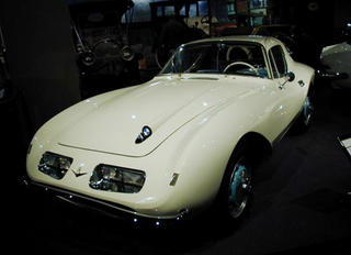
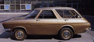
1957-1965 DKW 1000Sp - Thundering Ripoff
Auto Union was a well-established German car manufacturer before World War II with marques like Horch, Audi and DKW. Think German GM. The War changed all that when most of the Auto Union factories were destroyed. Still Auto Union managed to survive, but only one of the old Auto Union marques was revived: DKW - the brand for the masses (motorcycles and affordable lower middle class cars). Audi obviously came back from the brink as well - to be Auto Union's only surviving member.
As Germany struggled to get the economy up and going again, much effort was taken to bring Western Germany back to the top of industrialization. The economy and industry of the United States formed the example of which to strive for. US American design of the 1950s was transmitted by music and movies into Western Europe and was regarded as an icon for financial success, especially in Western-Germany which was still in search of a new identity (as the one that was just destroyed obviously did not want to be remembered).
Auto Union, like many car companies post war, found restarting to be hard. This left little room for developing new models and technology so post-war DKW cars were quite similar in construction and design to the pre-war models. In order to survive DKW needed something that at least appeared up to date. To revive the brand image a fresh looking, attractive and youthful car was developed: the 1000Sp.
The 1000Sp basically adobted US American space age style complete with tailfins but downsized to European proportions. To be more specific, they stole the look of the 1957 Ford Thunderbird. Underneath the dazzle lied Trabant-esque 2-stroke technology. It's not fugly in itself, but the idea behind it - a kind of automotive plagarism - is.
Tuesday, August 30, 2005
Superdickery
I just typed 25 minutes worth of an anti-GM tirade spurred upon seeing what they did to the "new" 9-5, and freaking Explorer crashed. Pissed.
I will bring you that story, but I don't want to retype it at the moment. It's new, and it's fugly. But I have no time this week to post (I had actually made a point to post that car as it unraged me so much).
So in the meantime, I present to you a site that has given me a couple days worth of laughs:
www.superdickery.com
Absolutely hilarious. Real comic book exerpts from the age of the innocent. It's funny how meanings can twist with age.
Wednesday, August 24, 2005
Raymond Loewy Betrayal
I'm a fan of Raymond Loewy. Studebaker Hawk. Coca Cola logo. Etc.
However, this rebodied BMW 507 is not up to par as he usually is. Especially considering the original bodywork. Sadly gone are the sleek 507 lines, replaced by an Avanti/63 Corvette bastard child. That being said, it probably helped inspire some of his more cohesive pieces (and Bill Mitchell).
SLZ3 Widebody
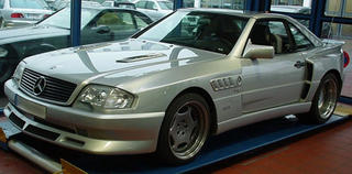
A Mercedes SL outfitted with a Koenig widebody kit, which doesn't look too bad. I'd give it a 8 out of 10. But then they stuck on BMW Z3 ripoff vents behind the front wheels. That instantly brings the looks down to -457 out of 10. I hate them on "ricer" cars, so it's 10 times worse on what should be a classy, expensive car (not to mention BMWs rival).
Grand Fug
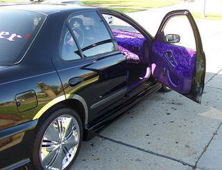
Hurry to ebay before it's gone! Stylish custom pre-1996 Pontiac Grand Am. Front bumper not only gaping, but headlights are also covered weirdly by bumper. Vintage mid-90's fad aqua, with large clashing purple and green vinyl stripes. Chrome rims ad bling, while black plastic louvered window decorations ad some 80's flava. Interior tricked out with unidentified fabric covering. Can be used for everyday transportation, or as a snowplow in winter. Being used for sod removal in above pics.
Total Eclipse of the Fug
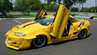
Wow. If a car with a bodykit is cool, then a car with a bodykit with a bodykit must be cool squared. Same must apply for wings. And vinyl. And scoops. So this car is like cool squared squared squared squared. It's so cool it looks fugly to the ordinary bystander, because we can't comprehend how cool it is.
Hmm - where to start. Let's see - the front. It's got some kind of bodykit, with horns or fangs attached. And on it's sides it has horizontal wings from which drops down another spoiler. This surrounds an oddly small intercooler. Scissors doors are of course necessary on a car of this stature as they're expensive and make it really hard to get in and/or close them. In true ricer fashion it has a (blank) windsheild banner to try and visually lower the car. But like headlight eyelids (which surprisingly this doesn't have), it only looks cheap. Speaking of window vinyl, this one has some kinda retro 80's bumblebee stripes down the rear quarter windows. And a yellow circle for some reason.
The rear end is a mangled mess. The obligatory Altezza taillights have been squashed together to make room for more scoops for ventilation of.... I guess the trunk, or gas tank. And of course a picnic table wing.
Overall, the look is "mutant wasp from hell".
Oh and it's part of the rather vague club, "USA Motorsports". Must've taken a while to think that one up.
Winding Roads Online Magazine
When I signed up for Google Adsense, I was sorta sceptical about it actually having content that visitors might use. For example - they might have a lot of discount auto sale ads, but that may not necessarily be what visitors of my site would want to look at.
However, today I clicked on one that said it had a review of a Mercedes at a site called WindingRoad.com. And low and behold - the site is pretty cool! It's an online car magazine, and it's free. As well as browsing the site, you can download each issue in pdf format, and it reads like a traditional magazine. You could even print it off if you felt the need to. And it looks pretty good as well - like a typical print magazine. How is it free you ask? Well - if you scroll down through the mag like flipping through a magazine, you'll come across full page ads. And of course the website contains ads too. But they're not intrusive and shouldn't be a nuicense if you read print magazines or browse the internet. And they don't have printing costs either.
Anyway, it's worth a look. But before you type in the address, see if there's a link in my google ad banner. Cause it'll give me a few pennies. :)
Tuesday, August 23, 2005
Lamborghini Saleen
When leopards attack...
Monday, August 22, 2005
Honda Life Dunk
Chinese American Cuisine
I'm sure you're aware that most Chinese restaurants in North America are far from authentic. I'm talking deep fried chicken balls in Iodine #1046 sauce. It's America's take on Chinese cuisine in essence. Dumbed down for out tastes. Often referred to as American Chinese cuisine.
In the car world, this happens as well. Although the Chinese are new to carmaking, the Japanese have been doing it for a while. American Camrys and Accords are bigger than their Japanese counterparts. The Avalon is a 6 seater created for the American market.
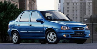
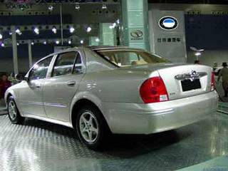
Due to the flood of car makers rushing to the Chinese automotive scene as the country gets their licenses, GM decided it had to have a chunk of the scene. It's using Buick. What you see below are the Chinese Buicks. GM thought long and hard and designed a whole new lineup for the country. AKA they took some Daewoos and rebadged them. Nothing could be further from what a Buick is meant to be. Harvey Earle must be rolling in his grave. Spinning even. As fast as a tornado (or Toronado).
Daihatsu Dressed
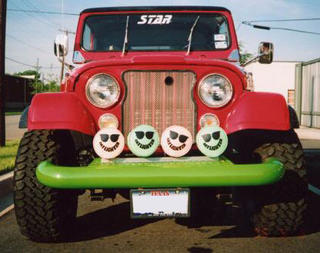
A Daihatsu naked dressed in a skewed So-Cal look that only the Japanese could do. Like putting wood grain on a Jeep wannabe. And painting it neon bogger green. And adding a weird patterned fabric to the seats that clashes completely. And topping it off with what appear to be West Coast Custom surfboards - something I did not know they did.
Daihatsu Naked
Another amusingly named Japanese minicar. For some reason they all have English names it seems. Anywho, this was actually a concept car brought to life, sorta like the Aztek. It's basically meant to look rugged (think Jeep or Hummer) by showing exposed bolts, exposed hinges and lots of creases that are meant for a rugged look. Yet it looks more "cheap" than "rugged".
Sunday, August 21, 2005
Coming or Going?
Powell Homer
Hot Fug
Attack of the Clones: BYD Fug6
Chinese automakers are new to the scene. Although they haven't hit our shores (yet) things are picking up fast. However, many of the cars suffer from being clones of other cars. It's like they're rushing so much to put the cars on the road they have to leech off others for inspiration (sorta like Hyundai does once and a while).
This company, BYD, not only ripped off the BMW logo but also the design of the current 7-series in their new F6. Off all the BMWs out, couldn't they have picked a better one to rip off?
http://www.bydauto.com.cn/
Saturday, August 20, 2005
Velour Interiors
Attack of the Clones, Pt. 10
Again, I wouldn't classify either of these cars as ugly.
On top is a JDM Honda Integra Type R (known to us as an Acura Integra). In Japan, Integra's have more conventional rectangular headlights. Mugan's kit for that car makes for a simple but effective look, adding some extra air intakes. Quite tasteful considering some of the more elaborate cars hailing from Japan.
However, being mostly Japan only, they probably didn't see the shocking similarity between the design and the 88-94 Ford Thunderbird. Ford gets the bonus points for having the look first.
Fug. Auto Fug.
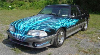
Electrifugging Disgustang
Break on Through to the Fugly Side...
Found this on sale on ebay...
When it comes to elaborate paint schemes, I've found a few that seem to defy logic. Most offen, people save an elaborate paint scheme - fugly or not - for the finished product. The final touch. However, this Eclipse had it applied to a relatively stock car. And of that paint job...
Man - it's ugly. Not only that, it's confusing. Exactly what is going on there? There's obviously two tears down the centre of the car, but what is "underneath"? A circus tents caught in a tornado? Also strange is that the sides of the car have absolutely no decoration.
Jeep FugxFug
Pinto Fuggin' Wagon
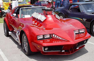
Corvette Fugger Recreation
Colani Corvette
Unnamed Kit Car Fug
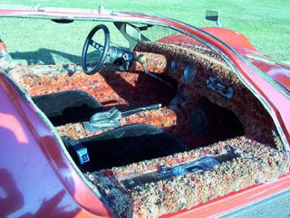
Found these couple pics of an older kit car, probably based off a VW Bug. Although missing doors, I'm not sure I would deem it to be 100% hideous, but maybe that's just because it bares a passing resemblance to the Durange 95, the sportscar in "A Clockwork Orange".
However, there's something odd about the cabin... What is that? Luckily they supplied an interior pic. It's SHAG CARPETING. WALL TO WALL. IN A CAR. Not only that, but it appears to be multi-coloured (although it may just be mold from rainwater due to the fact the car has no doors).
Colani Shark
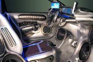
Giger C2
If H.R. Giger modified cars in the "rice" genre, I think this is what they'd look like.
Many people may not know who H.R. Giger is, but are probably familar with his work. The movie "Aliens" (and sequels) was highly based on his artwork. Also from his Hollywood work with "Aliens", he did some alien designwork for the movie "Species" in '95. Like "Aliens", Giger's work is dark and very organic with sexual undertones. Most features an organic and mechanical mix of elements. For more on Giger, visit his website:
http://www.hrgiger.com/
Anywho, this modified Citroen C2 looks like ground transportation on the Aliens' home planet. With neon jamed in every oriface.
Subscribe to:
Posts (Atom)