A blog devoted to RANTS ON AUTOMOTIVE DESIGN, car reviews, and - above all - fugly autos. whether looking for vehicular plagiarism or rides of extreme tastelessness, you've come to the right place.


Wednesday, August 24, 2005

Raymond Loewy Betrayal


I'm a fan of Raymond Loewy. Studebaker Hawk. Coca Cola logo. Etc.

However, this rebodied BMW 507 is not up to par as he usually is. Especially considering the original bodywork. Sadly gone are the sleek 507 lines, replaced by an Avanti/63 Corvette bastard child. That being said, it probably helped inspire some of his more cohesive pieces (and Bill Mitchell).

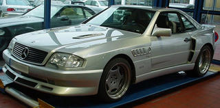
SLZ3 Widebody


A Mercedes SL outfitted with a Koenig widebody kit, which doesn't look too bad. I'd give it a 8 out of 10. But then they stuck on BMW Z3 ripoff vents behind the front wheels. That instantly brings the looks down to -457 out of 10. I hate them on "ricer" cars, so it's 10 times worse on what should be a classy, expensive car (not to mention BMWs rival).

Grand Fug


Hurry to ebay before it's gone! Stylish custom pre-1996 Pontiac Grand Am. Front bumper not only gaping, but headlights are also covered weirdly by bumper. Vintage mid-90's fad aqua, with large clashing purple and green vinyl stripes. Chrome rims ad bling, while black plastic louvered window decorations ad some 80's flava. Interior tricked out with unidentified fabric covering. Can be used for everyday transportation, or as a snowplow in winter. Being used for sod removal in above pics.

Total Eclipse of the Fug


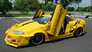
Wow. If a car with a bodykit is cool, then a car with a bodykit with a bodykit must be cool squared. Same must apply for wings. And vinyl. And scoops. So this car is like cool squared squared squared squared. It's so cool it looks fugly to the ordinary bystander, because we can't comprehend how cool it is.

Hmm - where to start. Let's see - the front. It's got some kind of bodykit, with horns or fangs attached. And on it's sides it has horizontal wings from which drops down another spoiler. This surrounds an oddly small intercooler. Scissors doors are of course necessary on a car of this stature as they're expensive and make it really hard to get in and/or close them. In true ricer fashion it has a (blank) windsheild banner to try and visually lower the car. But like headlight eyelids (which surprisingly this doesn't have), it only looks cheap. Speaking of window vinyl, this one has some kinda retro 80's bumblebee stripes down the rear quarter windows. And a yellow circle for some reason.

The rear end is a mangled mess. The obligatory Altezza taillights have been squashed together to make room for more scoops for ventilation of.... I guess the trunk, or gas tank. And of course a picnic table wing.

Overall, the look is "mutant wasp from hell".

Oh and it's part of the rather vague club, "USA Motorsports". Must've taken a while to think that one up.

Winding Roads Online Magazine

When I signed up for Google Adsense, I was sorta sceptical about it actually having content that visitors might use. For example - they might have a lot of discount auto sale ads, but that may not necessarily be what visitors of my site would want to look at.

However, today I clicked on one that said it had a review of a Mercedes at a site called WindingRoad.com. And low and behold - the site is pretty cool! It's an online car magazine, and it's free. As well as browsing the site, you can download each issue in pdf format, and it reads like a traditional magazine. You could even print it off if you felt the need to. And it looks pretty good as well - like a typical print magazine. How is it free you ask? Well - if you scroll down through the mag like flipping through a magazine, you'll come across full page ads. And of course the website contains ads too. But they're not intrusive and shouldn't be a nuicense if you read print magazines or browse the internet. And they don't have printing costs either.

Anyway, it's worth a look. But before you type in the address, see if there's a link in my google ad banner. Cause it'll give me a few pennies. :)