
Ssangyong is an Asian car company that was formed in 86, and since 1991 had had help from Mercedes to help improve quality control. In fact, one of their models - the Chairman (their only car) - uses the previous generation S-Classe underpinnings and looks pretty Mercedes-like. The Rodius does not.
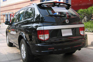
Along with the Chairman, the Rodius (or Stavic depending on where you buy it) fills out an otherwise SUV filled lineup which includes the Musso (an old, dated looking thing), the Rexton (amazingly very nice looking), and the Korando (so Jeep like they were sued and forced to change the grille).
Up front car-like headlights flank a weird triangular grille. The wheels like tiny and shopping cart like. The sideglass forms a sedan like greenhouse with an triangular window by the tail that sweeps around into the back window. I think it's meant to look graceful, but makes it look overly fat. The rear view from the drivers seat must be horrible.

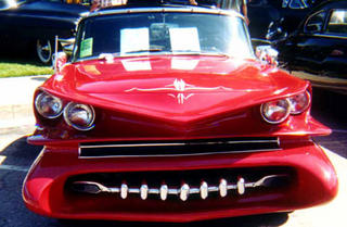
 Hmmmm... Well, lets start the disection. Front bumper looks to be off a mid-90's Grand Am, as does the dual kidney grille. But the grille is a bit too tall, so it must have been modified. The good and front fenders line up so nicely that they could be from a Grand Am too. The headlights are from a Taurus. As to the rest I'm lost. Sadly, from the rear it sorta looks like a Dodge Magnum. Love the rear window made of side windows in that classic crooked "I'm-a-hick-and-I-made-this-in-my-backyard" look.


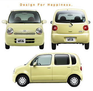
 Can't find too much info on this yet, but it's a relatively good looking design ruined by horrible front and rear ends. The front suffers from 3 air inlets which all appear to have different designs. And the rear has weird sheild like taillights that make the back look like it's frowning.


