Wednesday, July 20, 2005
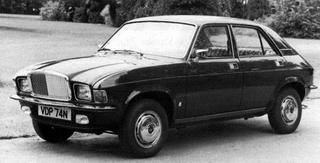
Vanden Plas 1500
Vanden Plas is not typically a same associated with ugliness. Currently it's a monicer for a long wheel base Jag XJ, which they inherited back in the day when the were part of the sad story called British Leyland.
Before it became part of British Leyland, they were a well known (and classy marque). After being bought they started a downhill slide. At first they were somewhat classier manufacturing Daimler limos and such. Then the 70's hit, and they started tacking on Rolls-like grilles on normal Austins and Triumphs and selling them as higher class Vanden Plas models. Some were ok looking, but still cheap cars with quality issues.
And then there was the 1500. It's based off the Austin Allegro. Many people hate the look of the Allergo. And although it sort of is a hump with wheels I like the Austin version - it sorta looks sleek. Add a melted Rolls grille and it does not.
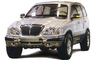
Volga 3106
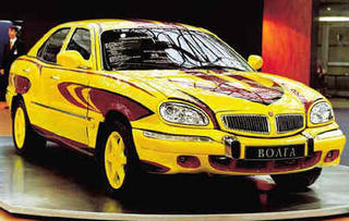
Volga 3111
To give Volga some credit, at least this car looks different. Those of you who watched "The Bourne Supremacy" saw Matt Damon driving this car's sibling - the Volga 3110. If you were unsure what year that car was made in, you can be forgiven. Although the front and rear are updated regularly, the doors and greenhouse have been basically the same for 40 years. Seems like a Russian trend...
The Volga 3111 uses the same platform and mechanical parts, but actually uses a smoother more attractive roofline (and is regarded as more upscale). Unfortunetly the front and rear styling resembles a sort of chrome insect... Up front there's a very Hyundai Sante Fe like feel with buldging front fenders. The headlights have very thick chrome rims and make the car look like a 1:18 scale model. In fact - all the features are exaggerated and toy-like. Most of which the huge round taillights which look either sad or surprised.
I suppose this car isn't hugely deserving of fugly status. I mean - it doesn't induce vomitting. But then they made a "tuner" version with a Lexus V8. But painted it an odd pattern of fuschia and yellow. Bravo.
SafuglyKar
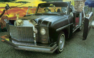
Bruce Mohs began making cars after forming the Mohs Seaplace Corporation. This - the "SafariKar" is actually his SECOND car, the first being another feature when I can find a good pic of it due to it being equally scarey.
The “SafariKar” is apparently his vision of a luxury off road vehicle. It’s metal top folded into the trunk, and had two huge minivan-like sliding doors. Because of it’s massive width it could seat up to eight – 3 BUCKET seats up front, a 3 person bench and 2 fold up seats for “temporary use in parades”. It's sorta the original Hummer I guess, except it wasn't designed for the army but for scaring small children.
If all this weren’t fugly enough, it’s exterior was coated in black Naugahyde. Yes - Pleather. Cause you know that woody wagons of the 70’s were so tacky. The brochure notes that "the Mohs body construction method utilizing cast Tenzalloy bulkheads, heavy-gauge aluminum sheet, polyurethane foam and Naugahyde covering is not only quiet in the extreme, but low in maintenance since there is no paint on the exterior of the car. You merely wet, wipe and dry for cleaning. No waxing. No polishing." I’m sure it’s owners (all 3 of them) found this very efficient if they ever got into an accident. Anyone know a good Naughyde guy?
I guess styling is partially inspired by Rolls Royce due to the massive grille, although this car just looks plain creepy up front with the glassed in headlights. This car is truly huge – those wheels are actually 20 inchers.
Interior features were just as odd - a refrigerator, a 2-way radio with a pair of base stations for home or office, a gold-inlaid Walnut instrument panel, velvet upholstery, Ming Dynasty carpeting, a 110-volt converter, and a butane furnace. This helped contribute to it’s slightly heavy weight of up to 6,100 Ibs. All this “Klass” is a bit expensive - $25,600 in the early to mid-1970s.
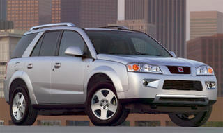
A Vue from Uranus
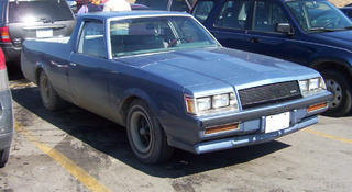
El Crappo
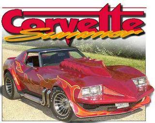
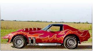
Corvetter Fugger
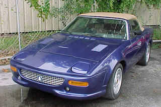
Fugerrari TR7
Mercedes-Benz Bionic Concept
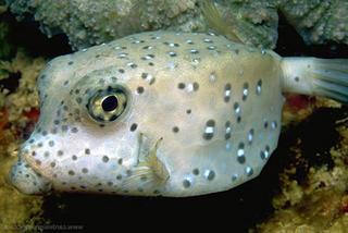
Mercedes-Benz - makers of some very nice looking cars - were inspired to design this after looking at a very ugly fish. Or maybe in an alter state after getting food poisoning at a sushi restaurant after eating one. I'm actually serious. Read the statement below from cardesignnews.com:
"The Bionic showcases the potential of bionics for automobile development, and is inspired by the boxfish. In DaimlerChrysler's words: 'Despite its boxy, cube-shaped body, this tropical fish is in fact outstandingly streamlined and therefore represents an aerodynamic ideal'."
Mitsuoka Le-Seyde
The slogan right from their website says it all: "Le-Seyde: We are happy, it's not logic."
Sadly their site is not as hilarious as it used to be. All their imagery had badly translate English overtop, but they've dumbed it down since then.
This however does not take away from their cars. All based off newer Japanese cars, their modified to look like older autos. Could you tell? All that the end up looking like is an awkward hybrid with clashing lines. This is AutoFug in the extreme.
Attact of the Clones
Welcome...
Enjoy...