A blog devoted to RANTS ON AUTOMOTIVE DESIGN, car reviews, and - above all - fugly autos. whether looking for vehicular plagiarism or rides of extreme tastelessness, you've come to the right place.


Friday, July 22, 2005

That's Fugly


That's square. That's boring. That's That's.

This car/wagon is the Honda That's. I hope that's not too confusing. It's called the That's. Those crazy Japanese... Not too much to say about it. Looks like the Scion xB/Toyota Bb which was designed to compete in the same segment. Which means they both look like toasters. I basically posted it mainly because of the name...

1980 Volvo 262C Bertone


Every Volvo in the 1970 through the 1980s pretty well looked them same. They were boxey, but they weren't terribly offensive. They were just - well - Volvos.

This basic bodystyle was introduced in 1974 in sedan, wagon and coupe form. But in 1977 Volvo decided it needed a car that was more luxurious and sporty for the top of it's line.

Basically the took a coupe, chopped the roof some, and gave it a Lincoln look and vinyl treatment. With the naturall tall boxy Volvo body below the waistline, the chopped roof looks squashed. It also seems they managed to cram a leather sofa in. Due to it's limited production it was produced by Bertone in Turin. Also due to it's limited production and being loaded to the gills, the 262C cost in 1980 twice the price of a 264 coupe. It was more expensive than a Jaguar XJS.

I wonder if it had Corinthian leather.

Attack of the Clones, Pt. 3


The Ford Scorpio was hideous. It looked like a bloated dead frog. The Sonata is much much better, but still suffers a bit for having large round headlamps flanking a narrow but wide grille.

Attack of the Clones, Pt. 2


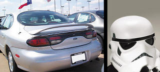
Ever since the "blob" Taurus debuted, I thought the taillights looked similar to the Storm Troppers helmet goggle area... Sadly I couldn't find a white Taurus pic to compare to.

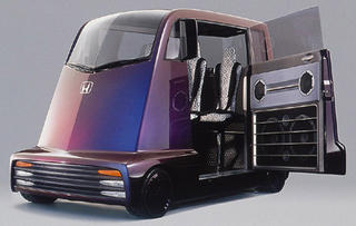
1999 Honda Fug-Mover Fuya-jo concept


The Honda F-Mover Fuya-jo. It's not only fugly, it's the stupidest idea for a car ever. Resembling a vacuum cleaner, the tall design of this small car with it's tiny wheels is to replicate the feel of riding a skateboard (really). It gets wierder. Designed primarily for the club scene, the high seats are designed to be similar to bar stools with minimal backrest. So you can FEEL like you're drinking while driving. And for those times you're stuck in traffic, there's a record turntable so you can "club it".

Toyota FXS


For a while, this was supposedly the look of the next Supra. Thank God that didn't happen. I suppose it wouldn't like as bad without the inexplicable oval on the front that contains the Toyota emblem, or the optical illusion rims.

Lamborghini Marzal concept


Bertone usually makes beautiful designs. Not this time. Remarkably, this car did evolve into a road car - the Lamborghini Espada. But thankfully not much was carried over other than the basic proportions and a similar looking front hood.

The Espada was a 4 seater with two doors, but there are a couple differences in those simularities. One is that the interior was not chrome, and the second is that the doors were regular sized and convential - not massive and gullwing. Gullwing doors can look nice, but not when they're twice the size of regular coupe doors. And almost completely glass.

Only stranger still (and hard to see in this view) the car had a strange hexagon theme. Maybe Mr. Gandini's conscience called out for him to stop while designing this car. The dash instruments were hexogans, the seats are vaguely hexagonal (as are the doors) and the rear engine cover was covered with hexagonal shaped holes for venting engine heat.

I should note the Espada was a front engine design, which is what this concept looks like it should be with it's long front hood.

1970 Lamborghini Espada Convertable


Your eyes do not deceive you - this is a Lamborghini. The Espada was introduced in the 1960s as a 4 seater luxury coupe with a Lamborghini V12. It was long and now, and not extremely pretty - but it did have a sleek look. The roofline continued all the way to the rear where there was an almost vertical glass hatch accompanied by a vertical pane to aid in rear view - like a CRX.

Because of this - it's hard to even think it would make a good convertable. Like CRX chop tops, it LOOKS like someone cut off the roof. To make things worse, someone decided PONTIAC lights would look better than the originals. PONTIAC parts on a Lamborghini - makes me cringe.

The Ugly BMWs - Part 1


In 1965, the BMW C2000 (and CS2000) was created. It was not pretty. But it was innovative - it's faired in headlamps are similar to those that appeared on the 5 series in 1995. However, back in the 1965 they were added to a shovel-nose front that made the car look almost boat like. The public did not like the look and not many were made understandably. Fortunetly, it gave birth to the beautiful 2.5CS (and 3.0CS) in 1968. It's amazing how much a new front can make a car look that much better.

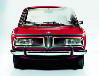
Unfortunetly, it wasn't soon enough to inflict the rectangular horizontal headlight look onto the BMW 2002's prediccessor, the 2000 (second pic). Thankfully this was soon changed, and the round headlights that became a BMW styling feature soon after has stayed (in some form) to this day.

Avon Jaguar XK Estate


Jaguar's design of the XK sedan is so classic that it has basically evolved since the late 60's intact, much like the Porsche 911. One of it's features is a low roofline that dives and tapers toward the rear. This does not make a good wagon. British aftermarket specialist Avon thought it would.

Introduced in 1980 it won afterwarket manufacturing awards for it's quality and efficiency of space. But it's still fugly. Note how the (usual) downward flow and tapering roofline of the sedan makes the wagon look oddly narrow and tall at the rear. The rear window almost looks square (it was lifted from an XJ-S, but in a much more vertical position).

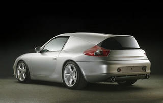
Protoscar Porsche 911 Wagon


Design solutions company Protoscar recently developed this wagon varient of the Porsche 911, which is both ugly and inefficient. There is no rear view - the black "window" in the rear is just the front of a panel that pulls out for storage. But because the 911 has it's engine mounted in the rear, storage space doesn't have much height. I could bear with them ruining a beautiful car if they actually made it more usable...

Dunham Corvodaro


SWEET MOTHER OF GOD.
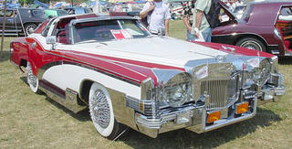
This one is much worse than it's sister the Cabalista. Believe it or not it's actually a Corvette too. But with a Cadillac Eldorado front and rear tacked on. And then they were much modified. This is like fugly overload. And these things were FOR SALE. And people BOUGHT THEM.

Lets see... The front is actually a take on a Stutz (another neoclassic) I think, with the huge round "headlights". Or chrome disks hiding the real headlights. Actually chrome is a continuing theme. Practically every vertical piece of body has a huge piece of chrome on it. Oddly the customary neoclassic side exhausts are sorta rectangular in shape. I'm not sure why - it just makes them bigger and uglier. Also note the hubcaps - they stick out so far they look like wire whisks. Handy for making whipped cream on the road? Or tenderizing roadkill?

Also looking at the side view, you can tell that a Corvette has a much shorter length stock than the Eldorado, and has a much shorter wheelbase. After the pieces are stuck on it looks like the wheels have been pushed as close to the centre as possible.

The rear end is so full of crap I don't know what to talk about. But I noticed one thing which got me thinking. The "trunk" has tie straps, which many neo-classics have as a throw back to when trunks had no latches but were tied shut using similar looking straps. BUT - the Corvette had no trunk. Just the glass/plexiglass hatch. One reason they did this was to keep the fuel filler/Corvette logo in the centre of the trunk. You can see the filler is still clearly in the centre of the trunk area. So does this mean that under the miles of metal rear of the roof is empty space that can't be used? That's efficient.

Ok - I have to stop looking at this or I'm going to have a seisure.

Dunham Cabalista


This is an odd one - a Corvette rebodied to look like a Cadillac rebodied to look like a Rolls. I especially like the "side exit exhausts" - they appear to be a moulded extention of the fibreglass body and have no actually hole for exhaust fumes to exit (they don't even LOOK fuctional). They do look like shark gilles though - maybe that's a Corvette connection.

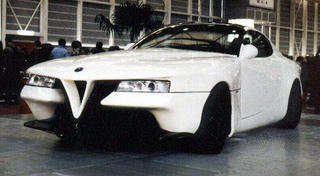
Alfa Romeo Vittoria

An Alfa Romeo SZ redesigned by Gioacchino Acampora. It's ugly.

Zimmer - Still Fugging


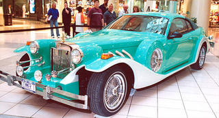
Much to my surprise, one of the "great" neoclassic car makers is still alive. Using Mustangs and Town Cars as their base, they can create for you a "masterpiece" for the low, low price of $100,000-$160,000. These beasts strangely have a bit of a celebrity following and Shaq was one of the first buyers of the new generation.

These chromerific Mercedes 500K rip offs follow the standard neo-classic theme of awkwardly blending a "Great Gatsby inspired" front ends with a modern cabin. The rears of these particular cars though suffer, as instead of using the common box-like trunk of most neo-classics they utilize the original car's trunk and rear fenders. Which makes weird cutlines and dinky round taillights sitting in the hollows where the original taillights were.

Zimmer tries to explain their existant on their website:

"When looking at a 1920s or '30s classic Duesenberg, most people just love the design and style. Their mind is filled with visions of grace, grandeur and the Great Gatsby. Unfortunately, the realities of owning and driving a classic or antique motor car eliminate most people from ever bothering to purchase one.

The cost factor is not really the major deterrent. Although very rare classic motor cars can cost several millions of dollars, you can find nice classics in the $50,000 to $100,000 price range. But for most people, classic cars are still totally impractical. The lack of readily available parts and service is a major drawback. The lack of modern safety equipment is another problem. And let's face it, the old classics are not very comfortable to drive or ride in. Thus was born the neo-classic motor car (neo=new), the best of the old and the new together in one grand motor car: a match made in heaven.

The new ZIMMER® Golden Spirit is the finest neo-classic motor car ever manufactured. The exterior design is pure classic grandeur right out of the Great Gatsby era, handmade to the highest quality possible.

Underneath, it is all a brand new, modern Ford Mustang or Lincoln Town Car base on the four-door sedan. You can drive into any Ford or Lincoln Mercury dealer and get full service, Ford parts and warranty work. It has all the latest safety and modern engineering features available. It's a joy to drive.

So, if you are ready for a motor car that is distinctive, that says, "I've arrived," that looks classic but is new and comfortable, a ZIMMER® Golden Spirit is for you. If you are a little tired of paying $75,000 to $150,000 for a car you can't find in a lot full of Fords and Chevies, then a ZIMMER® Golden Spirit is for you."