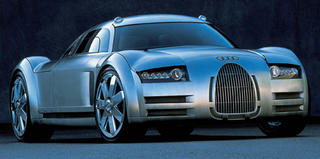
I understand the historical significance of Audi racecars. But this concept is a "case-in-point" about why retro is not necessarily a good thing.
Those old polished aluminum racers looked cool, and of course had their signature grille flanking the front. However, the grille looked good as the car was basically tube shaped and the grille took up the whole front of the car. On the Rosemeyer, it's stuck in the centre looking small and useless. And fugly. It looks like it sucked a lemon. And it doesn't help that the headlights arc down toward the edge of the body, making the car look sad to be alive. This concept really could have been much, much better. I mean - look at the Audi Avus.

1 comment:
This has got to be one of the most bizarre designs I have ever seen from Audi. They should have either gone retro all the way, or tossed this design in the trashcan before it got this far. It just looks so disjointed and whatever the exact opposite of harmonious and attractive is... OH, YES... "FUGLY"!!!!!
And YES, it DOES look "sad to be alive"! It's as if it saw itself in the mirror for the first time! Poor thing! :(
Post a Comment