A blog devoted to RANTS ON AUTOMOTIVE DESIGN, car reviews, and - above all - fugly autos. whether looking for vehicular plagiarism or rides of extreme tastelessness, you've come to the right place.


Sunday, December 21, 2014

Tale of Two Many Designers

Behold Toyota's first purpose built, hydrogen powered production car.  Yes, even you can walk down to your local Toyota dealership and buy one of these alien looking transportation devices and drive it home.  Well - if you live in California.


The Mirai has a tough act to follow.  In 1997, Toyota was at the automotive forefront of the alternative fuel movement with the Prius. The Prius quickly rose in popularity to become a household name, and it's aero-formed shape became iconic - eventually copied far and wide as consumers began equating it's shape to that of efficiency.  Witness how the Civic, and to and even greater extent, the Elantra, adopted similar "wedge-teardrop" profiles for their more mainstream, economy minded cars.  The Elantra is also proof that although you can make a slippery shape to drive sales, that alone will not guarantee spectacular mileage figures.


And then comes thes stylistic mess that is the Mirai. I think this may be Toyota's attempt at maintaining the lessons learned from the Prius's proven excellent aerodynamics, yet visually blinding you to the fact that the shape is a Prius copycat by hacking at the clay design models with a machete and stuffing some lights and vents that look like they belong on a refrigerator truck in the gaping wounds.  Out back you'll find odd, stacked taillights, seemingly borrowed from a very sad Bangle-butt 7-Series. Squint and you'll see a fuzzy, Prius-like outline.  Open your eyes and you'll see something that looks like a Star Trek prop.

Inside isn't much better.  Toyota seems insistent on continuing to use it's oft-maligned central stacked gauges.  In the Mirai, the infuriating setup centres an otherwise featureless expanse of dashboard broken by swooshes of plastic of contrasting colour and texture.  It looks futuristic, as if it was lifted from one of the space shuttles on the U.S.S. Enterprise.  But not necessary attractive, and there seems to be a lot of wasted space sitting directly in front of the front seats passengers.


Perhaps the most dramatic and off-putting aspect of the design are the exaggerated swooping fender lines, which are oddly amplified in the press photos; the setting sun on the horizon zig-zags across the body like a funhouse mirror.  I assume to it's wavy, undulating side are meant to emulate the Mirai powerplant's only waste product - water. Unlike water, the Mirai isn't very refreshing.

Friday, December 05, 2014

Leonardo DaFugly

This was at SEMA this year.  And yes, that's an airbrushing of Megan Fox on the hood, posing as Mona Lisa.  With a mustache. I cannot begin to fathom exactly why it exists.

Back to the Future

Almost fooled me into thinking this was a 1969 Charger.

Ford X2000

I kinda feel bad posting this, as it's an impressive achievement for one man to create.  However, that doesn't stop it from being ugly.

Back in 1958, Ford teased the public with a series of wildy futuristic cars with wildy futuristic powertrains. Problem was, the majority were just small models.  I'm not sure if it was for cost reasons, or because the logistics and risks of building a nuclear powered car were too overwhelming.  Regardless, it's probably good thing the roads were never populated by bad drivers strapped to atom bombs.

The original model from 1958.

One of these cars, called the X2000, inspired a British gentleman named Andy Saunders to build a full size version out of a 1962 Mercury.  What you see here is the result.  While quite close, things get a bit wonky when forced to adhere to the constrains of your typical front-engine production car.

Andy Saunder's full-size replica.

Fake Plastic Windows

The Toyota Camry is as much of an appliance as it is a car. People buy them because they're dependable, put together well and get you from point A to point B. They have about as much style and emotion as a refrigerator.

 The "sporty" Camry SE gets an aggresive new maw.

For 2015, Toyota hopes to at least change the its style to be something more than a generic transportation device. The changes are most obvious up front, where squinty headlights and a gaping grille lend a more sinister appearance that aligns more with the new gaping mouths on the Corolla and Avalon, as well as the recently facelifted X-nosed Yaris.

 Your run-of-the-mill 2015 Camry, soon to be seen clogging Wal-Mart parking lots.

However, as you move toward the back of the car, it's more obvious that this is just a facelift as the rest of the car shares much with the last generation model. And then you get to the D pillar.

Window?  Windon't.

It's as if the stylists at Toyota thought the car from the A-pillar back was too recognizably "old", so they stuck a black and chrome applique on the D-pillar to badly simulate an elongated greenhouse. It looks fake, and messes up the car's lines - it's basically change for the sake of change. Were it not for that sad piece of plastic, the refreshed Camry would not be featured on this blog.

The Navigator is Lost


 The 2015 Navigator is a bit of an automotive Coelacanth. Fresh from a recent facelift, its basic bones date back to its previous redesign in 2007, and that redesign looked like a mild evolution the one that proceeded it, which was introduced in 2003. 8 years is a lifetime in automotive evolution, where most cars would have been completely redesigned at least a couple times.


Improving on the 2007 Navigator shouldn't have been too difficult. 2007 was a time of uncertainty at Lincoln, as the brand didn't seem to know where it was going in terms of style. The 2003 Navigator was filled with outdated Lincoln cues - the vertical waterfall grille and taillights looked like your Grandfather's Town Car. In the mid-2000s, Lincoln released a series of concepts using the 1963 Continental as inspiration. The Navigator was one of the first Lincoln production cars to adopt a similar style, consisting mainly of a new glizty horizontal grille and wide rectangular taillights.


Where the 1963 Continental was understated and elegant, the same cues on the 2007 Navigator were awkward and garish. In my eyes it looks more like the tacky Lincoln luxo-barges of the 70s than it's stylish precedessors.

Which brings us to 2015. Lincoln must have realized translating the new "Continental" look into production cars that were basically warmed over Fords would be difficult. The only other Lincoln to share a similar face was the Lincoln MKX, and after which Lincoln began to phase in it's dual waterfall grille (another heritage based design that looks back to the Lincoln Zephur of the 1940s, and equally as polarizing).


Being the only holdover to the "1963" look, Lincoln designers decided to hack up the front end to add in a dual waterfall grille to match the rest of Lincoln's lineup. If you've seen the rest of Lincoln's lineup, you'll understand that making this front end treatment look good can be rather difficult. Especially when you're trying to splice it onto a boxy SUV that's basically a decade old.


Out back things look even worse, as Ford has obviously tried to keep sheetmetal changes to a minimum. The taillights are still huge, now full width but slightly narrower. The turn signal placement on the bottom of the outer pieces line up with cutlines in the tailgate, but the piece in the tailgate is painted body colour and will clash with the turn signals in any colour other than silver. I can only assume this is a stop-gap model until Ford develops a new Expedition and Navigator from the F-150's new aluminum intensive body. Let's hope the next Navigator corrects it's course.

Cadillac Seville Opera Coupe

I've posted the Seville Opera Coupe before, but one just came up for sale on eBay.  It's in beautiful condition, yet still quite ugly.  The perfect car to overcompensate for your manhood or lack thereof.

Thursday, December 04, 2014

Lamborghini Sogna


No, this isn't some cobbled-together set piece from Bladerunner - what you're looking at is a reskinned Lamborghini Countach that was intended for sale to the public.

It was created in 1991 by Japanese tuner Ryoji Yamazaki, as a showpiece for that years Geneva Auto Show. He originally had plans to build a series of them, but possibly decided against it due to public reaction to the green monster. Looking somewhat like a Counch, Diablo and a frog thrown into a blender, it doesn't really have even one good angle.

It was for sale late last year for the low, low price of $3.1M USD, although I haven't seen any reports that it's sold yet. Remarkable, I know.

Mitsuoka Oronchi Evangelion Edition

I've posted this strange McLaren F1/Swamp Thing/Ford Taurus "supercar" before, but I'm posting it again.  Mainly because its production is ending, and as a final farewell they're selling the last remaining few as this Mitsuoka Oronchi Evangelion Edition. Its paint job is influenced (and named after) the Japanese anime TV show Evangelion, for some reason.  I guess maybe the demographic for buyers of supercars that look like a mutated fish also watch cartoons about a child-piloted giant cyborg that fights angels.


Monday, November 03, 2014

Singa-Poor Taste, Part II


Another from my friend in Singapore, this one seems to draw inspiration from Barbie's Power Wheels Jeep. The two spoke wheels are a nice touch...

Singa-Poor Taste, Part I


A friend of mine working in Singapore recently sent me some rather interesting rides he's seen recently, such as this Toyota MR-2/MRS with more scoops than Baskin Robins. Sadly, given the outrageous car prices in Singapore, this car probably costs more than a Ferrari (a Ferrari purchased in North America that is).

Tuesday, September 30, 2014

Custom Pontiac Destroy-It-With-Firebird

Found via eBay, this beauty - believe it or not - is fitted with a custom body kit. Penned by the skilled hands of the world's foremost toddler car designer, it's vaguely reminiscent of a Ferrari Testarossa with the front end of a Cavalier.  Randomly applied rectangular bump strips on the front and rear protect roughly 10% of the car from dings.  The front end features a RAM Air hood and an innovative 4L gas tank sitting precariously in the grill.  Crash test results pending.

The interior features trimless doors for weight savings, and a 6" slab of a leather sofa haphazardly glued to the dash for the occupants safety in the even of a crash.


Gh-Gh-Gh-Ghia!

Chrysler and Ghia's show car partnership of the 50's produced some of the more elegant designs of the 50's. The US automotive world was just beginning to see these flights of fancy, as previous to Buick's Y-Job of 1938, no one really made them. However, because the stylists were new to this unrestrained artwork, the end products were usually extreme works of automotive fantasy bordering on garish, with lots of chrome, flares and fins.

The scene in Europe at the time, however, was much different. Independant coachbuilding firms like Bertone, Pinin Farina, Ghia, and Figoni & Falaschi were taking cars ranging from the pedestrian to the extremely expensive and transforming them into works of art, and had been doing so for a while. These firms arguably pushed automotive styling into the future, with a certain elegance and often times a lack of flourish usually absent on American cars of the same period.

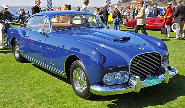
1954 Chrysler Ghia Special GS-1

Chysler witnessed this first hand when invited by Fiat to Italy to give American insight to aid in their volume manufacturing techniques. Chrysler president K.T. Kellar was inspired, and set to work producting the series of show cars featured in this post.

The outcome was a bunch of remarkable similar concept cars, each refining the lines and design themes of the last. Their signature organic curves, the rise in the shoulderline over the rear wheels, inset headlights and narrower, "egg crate" style grille make for instantly recognizable cars. They were popular enough that they even sold some in production guise (the images included in this post are both production cars).

Built by Carrozzeria Ghia in Italy, many assume that they were designed by Ghia was well, given their restrained European looks. However, they were the product of Virgil Exner, then a fledgling automotive desinger at Chrysler. Somewhat ironically I suppose, as he was resposible for the fantastic fins of the "Forward Look" Chryslers of the late 50's, and nearer the end of his career he was producing some rather strange an ungainly designs that have been featured here before.

Which brings me to the ugly part of the story - this car.

Uh oh - the front is melting.

Although I haven't found much info on this car, it appears to be a one off production car from 1954, designed by Virgil Exner in the vein of the rest of the Chrysler Ghia coupes of the period. All the cues mentioned above are in place, except for one noticable difference - the headlights. Where the other cars have single round headlights placed slightly inboard of the fenders, this car has inset quad headlight place so low on the front end they look like an early experiment for fog lights. The featureless expanse of bulging sheet metal above makes the car look ungainly, even larger than it already is, and to be honest a little sad and defeated. What were elegant lines begin to look more like a depressed block of soap.

The sole ugly sibling in a family of supermodels. Must be rough.

Sunday, September 28, 2014

Cue the Q

In 2014, Infiniti choose to rename it's entire line of cars and SUVs. A risky move for sure, one that can lead to confusion (just look at what happened to Lincoln). But confusion is an understatement this time around.

Infiniti wants you think of the letter Q when you see an Infiniti.  Why Q?  I assume it's because of the Q45, which was it's first model - one that strove to be different.  And maybe that's what Infiniti wants to be again.  But there inlies the problem - they had a car model called the Q45, which was always their halo model.  Maybe they want people mistaking even their cheapest car for their halo model?

The 45 in Q45 originally stood for displacement.  And this is the next confusing bit - they now want the number just to signify a size of car or SUV.  Think Audi or Mazda.  Except they'll still use two numbers for some reason.  Maybe to look like their old naming structure?  I think the reason for this is because engine sizes are decreasing as fuel efficiency is a concern.  And with turbos flooding the market, displacement shrinks even more.  Having a Q45 one year and a Q35 the next might have some people thinking it's less of a car.  You can see this over at BMW and Mercedes, whose model names also used to refer to displacement. Nowhere is this more obvious than in the 3 Series.  The E36 328i was a top-of-the-line model with a 2.8L six. Today's 328i uses a 2.0L turbo four. You could call it a 320i, but the designation was typically a lower rung model - it's been the base model 3 Series for a while now, powered by a non-turbo 2.0L four.  Borrowed displacement it is then...

 
Inifiti QX80: New Name, Same Angry Hippo Looks

Back to Infiniti.  The displacement issue has already cropped up in a couple of ways.  The first, most obvious one centers around the QX56, which was renamed the QX80.  No - it doesn't have an 8.0L V8 now.  But now it's joined by the QX50 (previously the EX35/EX37), QX60 (briefly on the market as the JX35), and the QX70 (previously the FX35/FX45).  QX50, QX56, and QX60 are all so close when written, but are all drastically different vehicles.

And then there's the Q40 and Q50, which both used to be called the G37.  When the last G37 was up for a refresh, it happened just in time for all this Q renaming nonsense.  So when the new generation of G37 came to be, it was rechristened the Q50.  So what exactly is the Q40?  Infiniti dealers were wanting a base model to get more people in the showroom.  The Q37/Q50 being their current lowest priced model, Infiniti decided to continue making that last generation Q37 and sell it as a Q40.  The car is identical - it just has a new name 10 digits less than the QX50 so it fits in the new naming structure hierarchy.

G37? Q50? No - Q40!

Oh yeah - and the G37 coupe was renamed the Q60, but unlike the Q50 (and like the Q40), it isn't a redesigned model and was simply renamed, which may or may not mean the coupe may begin to stray farther from it's sedan roots.

G37? Q50? Q40? No - Q60!

So there you have it.  Thoroughly confusing.  Hopefully it will make more sense with time, at least until they need a model smaller than the inevitable Q10.

Saturday, September 27, 2014

Subarundai

Hyundai's new 2015 Sonata I find to be quite a looker. It's exerior has matured yet it still looks like a Sonata. Gone is the garish chrome waterfall grille, abandoned for a sleeker front end that has some family resemblance to it's older brother, the Genesis.


However, that matured mug also is a bit more generic, looking a bit like other premium brands like Audi and Volvo. And then seeing a the newly revised Subaru Legacy today in the flesh, it hit me that it looks a lot like the new Sonata (although, like the Sonata, it simultaneously looks like an evolution of the last Legacy). It's like the two designs evolved to look like siblings - the Legacy your average sedan, and the Sonata the sporty "4 door coupe" version.

Roundel Rondo

This post may be a little confusing for those living in the US, where the Rondo was discontinued in 2010 after slumping sales and the debut of the redesigned 2011 Sportage, which they assumed would fill the void left by it's departure.

However, this wasn't the case in Canada, or most of the rest of the world where the model is known as the Carens. Sales were better in Canada and model carried on, albeit with a revised front end featuring the now standard punched grille.

But enough with the history lesson. What you see here is the next generation Rondo/Carens. It's much more attractive than its dowdy predecessor, and is still missing from the US lineup.


The newfound attractiveness comes at a price though, as it's very close to the BMW 2 Series Active Tourer, which itself is based on the 2012 Concept Active Tourer show car. Yet another recent Kia design that seems to borrow heavily from the BMW school of design  Even the rims above are similar. Regardless, it's one of the better looking small people carriers. I even think I like it better than the BMW, which manages to look not a lot like a BMW with its Mini based-bones.


IS BS


I’m not sure what’s going on over at Lexus. They’ve adopted a style best described as “psychedelic origami predator by Nike”. Their goal was to energize the brand and make it more attractive to a younger generation. Apparently sales have increased, but the polarizing designs are definitely ones you love or absolutely abhor. I’m one of the latter, although the more recent sportier offering like the RC coupe wear the look a little better. Maybe this is one of those cases where the designers eventually evolve the design, with each successive generation learning how to make things more cohesive. Almost like automotive natural selection.
For now I’ll focus on the latest IS, as it’s a good example of what I hate with the current Lexus designs. Other than the limited production LFA, it’s their first model to draw heavily from the extreme and similarly polarizing LF concept cars, with it’s sweeping contours and sharp edges. I should say that I’m not hating on the complete IS package – I actually find most of everything aft of the A-pillars quick sleek and refreshing. Speaking of the LFA, if you look closely at the front of the LFA, you’ll see the spindle shape as well, albeit not in grille form.

Spindle Grille or Mandible Mug?


The Lexus “spindle grille” is where it all started (although to be fair, not on the current IS but on the 2011 Lexus GS). Such a large grille opening can be hard to pull off. Audi has managed to produce some nice looking front ends, but it’s definitely hard to pull off successfully. Although the Lexus grille doesn’t look as “fake” as some, it looks like someone tried to suck the front end off with a vacuum. It also kind of looks like this attractive fellow.


Nike-like

Just as I was getting used to the grille, Lexus threw another design signature into the mix with LED driving light separated into their own units, slashing into the front fascia like metallic Nike swooshes. The IS is notable for being the first Lexus model to adopt this design feature. I guess it’s something we have to get accustomed to, as it’s also appearing on their new NX SUV, which is fugly enough to get a post all it’s own.