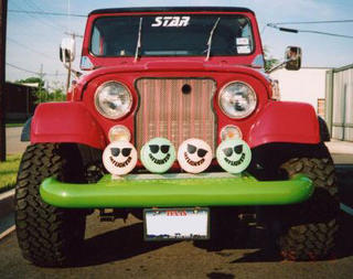
Another from my friend in Singapore, this one seems to draw inspiration from Barbie's Power Wheels Jeep. The two spoke wheels are a nice touch...
A blog devoted to RANTS ON AUTOMOTIVE DESIGN, car reviews, and - above all - fugly autos. whether looking for vehicular plagiarism or rides of extreme tastelessness, you've come to the right place.
Showing posts with label Jeep. Show all posts
Monday, November 03, 2014
Friday, December 17, 2010
Photoshop < Actual Photos
I know it seems like I'm ragging on Chrysler a lot, and part of me feels as if it's unfair. The companies been through hard times and is trying to restructure itself as best it can. But things like this bug me, due to their half-assed attempt.

The 2011 Jeep Compass, I have to say, is not fugly. The did a remarkable job of curing the fugly it once suffered from with little more than a new nose. Bravo!
However, did you really have to photoshop some of the first official images of the newcar SUV? This is the publics first polished view of the car, and I'm sure those not graphically aware will think there's something slightly odd about those monochromatic reflections and flat looking colour. The cincher? Whoever did it painted right over the three holes below the 7 slot grille.

One has to ask - couldn't they just take pics of the Compass painted the right colour? Or at least keep it the colour it used to be. Or, you know, hire someone to photoshop it correctly. And as a graphic artist it pains me to say I'd rather see it one of the two previous options - however talented you are, things look most real when they're actually real. For me it taints their image when it wouldn't cost much more to do things right for a vehicles launch (or at least plan in advance and making and bring a red Compass with you).
*EDIT - looks like there's a whole series of them, some work better than others. I'm guessing they only had a grey Compass at the time of shooting. Below you can see a similar situation with the 3 slots, and this time the Compass badge of the door has a blue tint, like it wasn't cropped out. I admit convincing colour changes like this are difficult, but those areas look a bit sloppy.

The 2011 Jeep Compass, I have to say, is not fugly. The did a remarkable job of curing the fugly it once suffered from with little more than a new nose. Bravo!
However, did you really have to photoshop some of the first official images of the new

One has to ask - couldn't they just take pics of the Compass painted the right colour? Or at least keep it the colour it used to be. Or, you know, hire someone to photoshop it correctly. And as a graphic artist it pains me to say I'd rather see it one of the two previous options - however talented you are, things look most real when they're actually real. For me it taints their image when it wouldn't cost much more to do things right for a vehicles launch (or at least plan in advance and making and bring a red Compass with you).
*EDIT - looks like there's a whole series of them, some work better than others. I'm guessing they only had a grey Compass at the time of shooting. Below you can see a similar situation with the 3 slots, and this time the Compass badge of the door has a blue tint, like it wasn't cropped out. I admit convincing colour changes like this are difficult, but those areas look a bit sloppy.
Saturday, September 25, 2010
Chevroleep Grand Blazokee
Friday, September 10, 2010
Attack of the Clones: Durango Fandango
I should start off by clarifying that my "Attack of the Clones" posts (admittedly a dated title, but I don't know if I should stop after using it for so long) aren't necessarily saying that the cars featured within are ugly. I realize this may be a bit confusing. I mean - the blog is about ugly cars. However it's mainly a blog where I vent on automotive style, so I think posting cars that tread previously travelled roads when it comes to style are ok to be featured. But I wanted to sure to clarify this, as I don't think the Dodge Durango is an ugly truck.
When Dodge teased shots of the new Durango (although I have to say I prefer the Magnum name, but I understand it's good to maintain consistancy), I thought the revised face was refreshingly attractive, yet masculine and bold. Plus I love the new divided cross hair grille (the new Dodge logo, not so much). I had high hopes from the rest of the truck, mainly because Chrysler corporation cars and trucks have been so disappointing for the past few years, especially since they were a high water mark for design in the 90's.
However, new that the shots of the entire truck have been released, I have to admit I'm a little let down. Not that it's ugly, but from the headlights back the flowing curves look remarkably like those on the Buick Enclave (of the two, I prefer the Durango however). I guess I was expecting something a little more butch, given the angry front end treatment. Although I suppose it's platform-mate the Grand Cherokee got the masculine square shouldered lines, so the Durango had to be unique to that end.
Which is strange considering the taillight treatment. Looking at the rear of both trucks, it's actually a bit hard to tell them apart. I suppose the reverse lamps/turn signal locations are flipped, but the shape of the trapezoid taillights are the same - and both have a chrome strip connecting them. I little variety wouldn't hurt, especially since the trucks share a majority of parts.
When Dodge teased shots of the new Durango (although I have to say I prefer the Magnum name, but I understand it's good to maintain consistancy), I thought the revised face was refreshingly attractive, yet masculine and bold. Plus I love the new divided cross hair grille (the new Dodge logo, not so much). I had high hopes from the rest of the truck, mainly because Chrysler corporation cars and trucks have been so disappointing for the past few years, especially since they were a high water mark for design in the 90's.
However, new that the shots of the entire truck have been released, I have to admit I'm a little let down. Not that it's ugly, but from the headlights back the flowing curves look remarkably like those on the Buick Enclave (of the two, I prefer the Durango however). I guess I was expecting something a little more butch, given the angry front end treatment. Although I suppose it's platform-mate the Grand Cherokee got the masculine square shouldered lines, so the Durango had to be unique to that end.
Which is strange considering the taillight treatment. Looking at the rear of both trucks, it's actually a bit hard to tell them apart. I suppose the reverse lamps/turn signal locations are flipped, but the shape of the trapezoid taillights are the same - and both have a chrome strip connecting them. I little variety wouldn't hurt, especially since the trucks share a majority of parts.
Sunday, September 05, 2010
The Incredible Hack
Friday, April 21, 2006
Caliber: Compass' Slightly More Attractive Sister

The Caliber shares it's platform with the Jeep Compass below, and is the main reason why the Jeep's definition of going off road is occasionally jumping a curb. However, the Caliber is a bit better looking, in a kind of shunken Magnum kind of way. However when you get to the rear, you notice it has an ass like Hank Hill. Basically the car seems to taper off to nothing, with huge taillights, that together look to be almost the width of the hatch. Not only does it make it look too narrow and top-heavy, it looks like it wouldn't handle good or hold much stuff. And it makes it look fugly. From the rear anyway.
BTW - the photos on the Dodge website naturally don't particularly show it's ugliness (why would they after all). To truely see the shrunken ass effect, look at one in person.
Jeepers that's Fugly
Introducing the 2007 Jeep Compass - the first obese Jeep. At least it looks that way, but it's actually the smallest and least off-road capable of the Jeep family. It's nice that they styled it too look that way. It looks bloated. Like a whale carcass.

Those huge wheel budges are the main cause - they take up the entire side of the vehicle. In the same way, the front bumper seems huge, especially when it rises on the edges to meet the turn signals.

* I should also note this is the only Jeep available NOT "Trail Rated". It's fraternal twin, the Jeep Patriot, is. And looks much, much better. So what exactly IS the point of the Compass?

Those huge wheel budges are the main cause - they take up the entire side of the vehicle. In the same way, the front bumper seems huge, especially when it rises on the edges to meet the turn signals.

* I should also note this is the only Jeep available NOT "Trail Rated". It's fraternal twin, the Jeep Patriot, is. And looks much, much better. So what exactly IS the point of the Compass?
Wednesday, August 31, 2005
Lamest Hummer Ever
Saturday, August 20, 2005
Jeep FugxFug
Subscribe to:
Posts (Atom)