

Might as well kill two birds with one stone here:
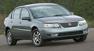
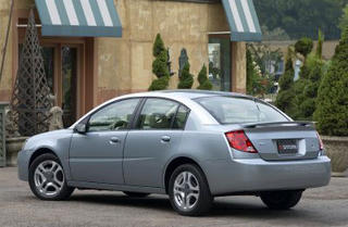
The Saturn Ion. It was born ugly, only to recieve a facelift where it needed it the least and came out fuglier than it went in. The worst part about the Ion is it's rear. Multiple cutlines meet in an odd pattern that looks as if part of the taillights are covered in plastic on the side. When it received a facelift this was left unchanged, yet they added an awkward larger grille. Note that the previous horizontal bar grille left indents on the headlights. As a cost cutting measure they used the same headlights and simply added a small chrome triangle to fill in where the previous grille left off. Classy. I think the only thing that could look worse is primer coloured bodyfill.
Another interesting note: on the orginal Ion some of the packages left an arc of grey coloured plastic over the doors. No matter the colour of the car, the colour of the plastic stayed them same. If you ordered a grey car, than it looked as if that particular part was painted the wrong colour. The rear view I've attached is of the first gen Ion so you can see the colour difference. I think they elimated this "feature" with the facelift.
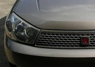
The Saturn L200/300. In it's first generation it was a midly attractive if boring Opel Vectra clone. For some reason Saturn decided to give a mid-life facelift, including huge stretched headlights and a larger grille. The new version looks shocked and angry. Also, the grille is now made of hundreds of versions of the Saturn emblem. If that's not overkill, I don't know what is.

1 comment:
It's totally understandable why the SaturUranus is shocked and angry! It saw itself in a mirror! Makes you feel kinda bad for the little things! :(
Post a Comment